3rd Science and Culture Festival Brand Identity
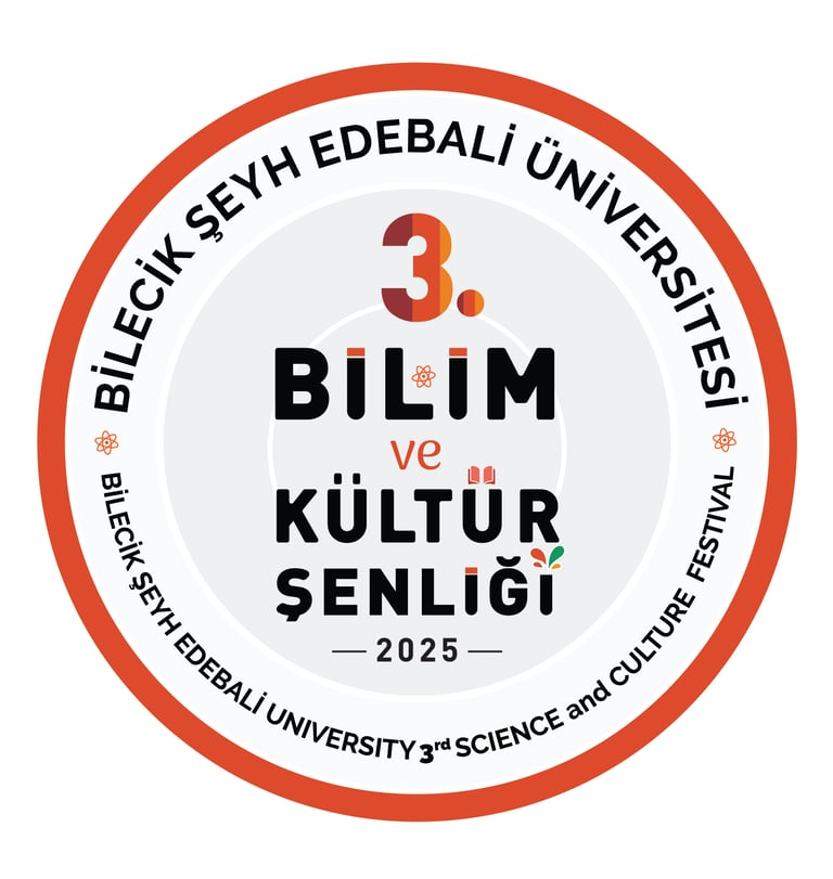
The logo designed for the 3rd Science and Culture Festival of Bilecik Şeyh Edebali University possesses a rational framework symbolizing the dissemination of knowledge and interdisciplinary interaction. The concentric rings expanding from the center of the design visualize the university's mission to radiate knowledge from its academic core to society. The symbolism embedded within the typographic details reinforces the academic and scientific nature of the event: the book form atop the letter "Ü" represents the foundation of education, while the letters "İ" are stylized as test tubes, making a direct reference to scientific research and laboratory culture. The color palette maintains the bond with the university's institutional identity while reflecting the dynamism and celebratory atmosphere of the festival through vibrant tones. Each visual layer, combined with a technical drawing aesthetic, marks the powerful focal point where science merges with culture.
Zero Waste Coordination Brand Identity
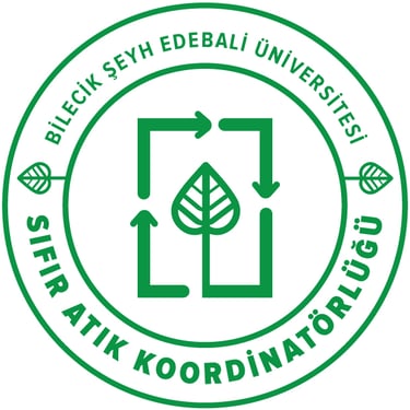
The logo design for the Bilecik Şeyh Edebali University Zero Waste Coordination Office focuses on the principles of circular economy and institutional identity. The most distinctive feature of the design is the recycling arrows, which are constructed by referencing the formal language of the university's own corporate logo. By integrating the structural lines of the university’s emblem into the recycling loop, the design emphasizes that the institution has internalized its sustainability vision within its core identity. Composed with a linear and minimalist aesthetic, the design balances the geometric path symbolizing systematic waste management with the organic leaf form, reflecting that eco-friendly policies are carried out with institutional discipline..
Continuing Education Center (SEM) Brand Identity
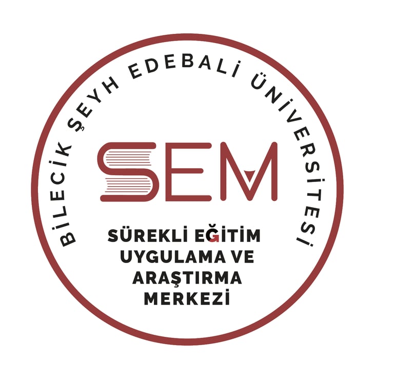
The brand identity designed for the Continuing Education Application and Research Center (SEM) at Bilecik Şeyh Edebali University reflects the center's dynamic structure and educational mission through a cohesive corporate language. The typographic arrangement of the design is enriched with clever symbolic details that represent the fundamental tools of the learning process. Within the "SEM" logotype, the letter "S" is transformed into the form of a book to symbolize academic knowledge, while the letter "M" incorporates a pen nib representing creativity and the transfer of information. A distinctive arrow detail integrated into the tail of the letter "Ğ" in the full title emphasizes the continuity of education and personal growth. Developed in full harmony with the university’s corporate colors, this work blends academic rigor with modern symbolism to represent the center's visionary identity.

BİYOTEKMER Brand Identity & Logo Design
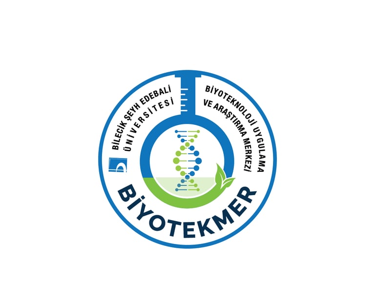
Designed for the Biotechnology Application and Research Center (BİYOTEKMER) at Bilecik Şeyh Edebali University, this visual identity merges academic rigor with the innovative spirit of modern biotechnology
The core of the design features a DNA double helix transitioning into living leaves, symbolizing the synergy between genetic research and sustainable ecological solutions. This central motif is framed by a laboratory flask silhouette, a subtle use of negative space that highlights the center’s focus on experimental application. The choice of professional blue and vibrant green reflects a balance of trust, innovation, and environmental consciousness. The circular composition ensures a cohesive hierarchy, establishing a strong and recognizable institutional authority within the scientific community.

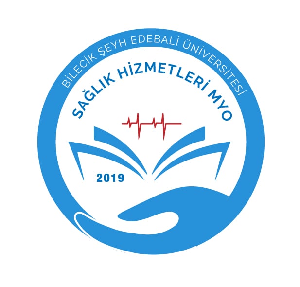
Vocational School of Health Services Brand Identity
This logo designed for the Vocational School of Health Services merges compassion with academic expertise in a single visual language. The hand figure at the base symbolizes "care" and the "human-centered" approach of the healthcare sector, while the open book form rising above it represents the steadfast power of education and scientific foundations. The ECG (heartbeat) line emanating from the heart of the book is a critical detail highlighting the vitality of education and the dynamism of health sciences. Utilizing the university’s corporate colors to reinforce institutional identity, the design communicates the school's mission directly and effectively through its chosen iconography.
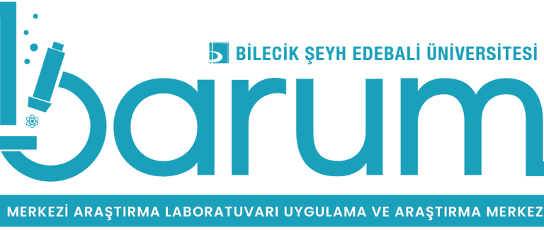

Central Research Laboratory (BARUM) Brand Identity
The logo designed for the Central Research Laboratory Application and Research Center (BARUM) at Bilecik Şeyh Edebali University presents scientific precision and advanced technological research through a typographic arrangement. The focal point of the design, the letter "b," has been transformed into a microscope form to reflect the core spirit of the laboratory. The atom symbol beneath the microscope lens and the rising bubble details symbolize the center's analytical capabilities at the micro-level and its innovative energy. The turquoise tone, chosen in alignment with the university’s corporate identity, represents the composure and professionalism of modern science, while the strong typography reinforces the center’s academic authority.
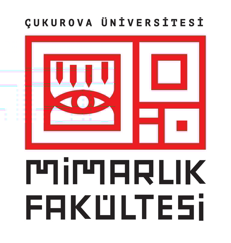
Faculty of Architecture Brand Identity
This logo design integrates the rational and aesthetic values of architectural production with the discipline of the golden ratio. The nested squares forming the core of the design are constructed with mathematical precision, and when viewed from a top-down perspective, they resemble a modern architectural technical drawing or floor plan. The eye and pen motifs at the heart of the composition serve as direct references to the essential architectural processes of "observation and drafting." Within the custom logotype, the letter "M" specifically incorporates structural forms that evoke architectural elements and building blocks, establishing a professional dialogue in every detail of the design. The bold contrast of red and black underscores the faculty’s prestigious yet dynamic academic presence.
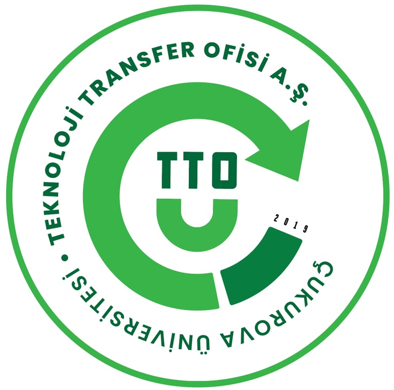
Technology Transfer Office (TTO) Brand Identity
Designed for Çukurova University Technology Transfer Office Inc., this logo reflects the dynamic nature of innovation and university-industry collaboration. The circular loop, achieved using the golden ratio, functions as a technical diagram representing the transformation of knowledge into technology. The "TTO" acronym at the center is built upon a stylized base formed by the letters "Ç" and "Ü," representing the university's institutional identity. The rotation arrow emphasizes continuous development and technological transfer, while the technical drawing aesthetic of the overall composition reinforces the office's engineering and R&D-oriented professional approach.